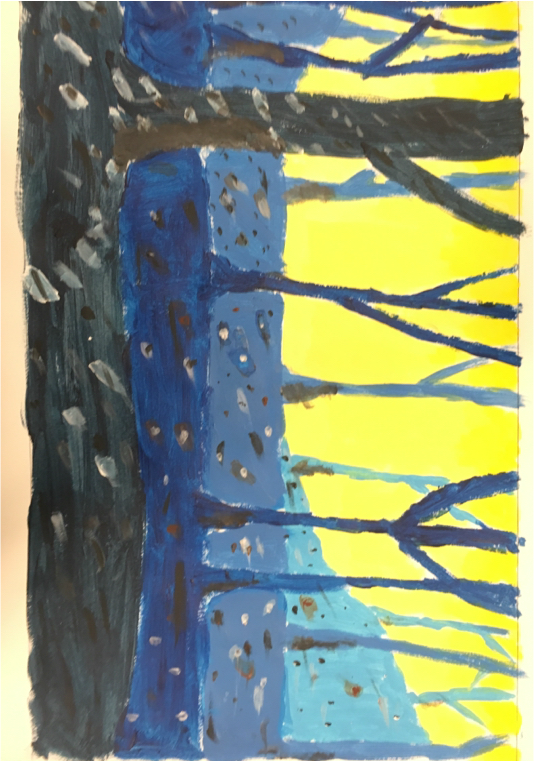
 The Point of this project was to make realistic spooky trees using paint and dots to make them look three dimensional. In this artwork I used paint to make the trees a darker shade of color and lighter paint in the back for a fading effect. One thing that I learned was to put the layers in the background in a lighter shade of the original color to show it fading away the further it got from the big tree. 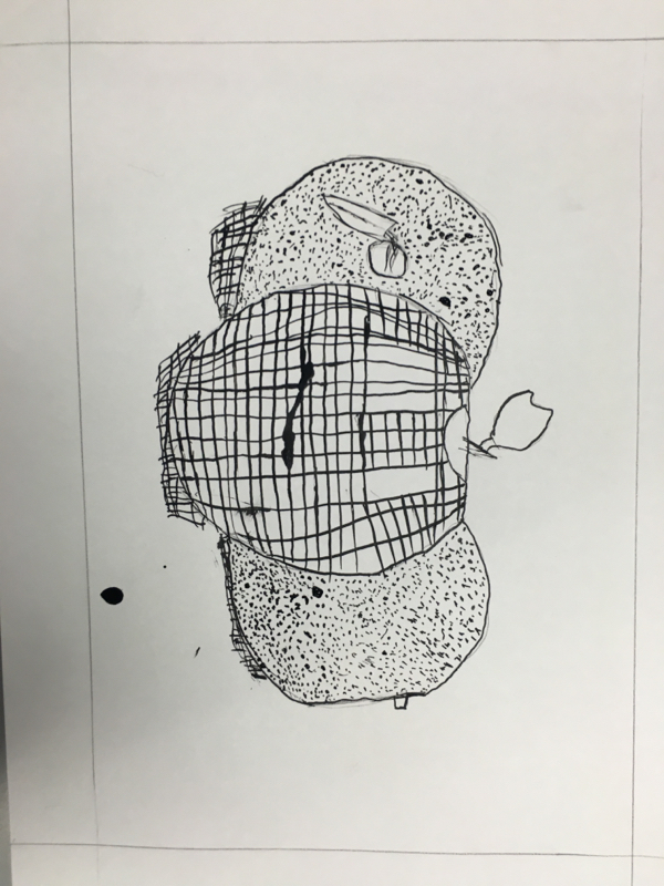 The Point of this project was to remake one of your previous paintings using a different technique. In this artwork I used pen and ink instead of the original paint. One thing that I learned was to put the lines and dots closer together to show the shade or value on the apples. I used crosshatching and stippling to show the different amounts of light between the apples and the color between them.
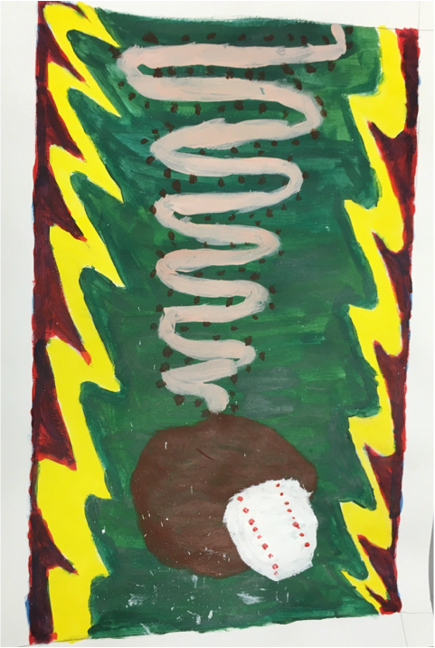 The Point of this project was to make a realistic picture, using acrylic paint. One thing that I learned was to use dots in the painting to show time. Using different colors play a big part in contrast. If it was all the same there would be no contrast in the drawing. The mood to this boring and slow but later on when the ball is in the glove it gets exiting.
 The Point of this project was to make a realistic picture, using ink and a block print. One thing that I learned was to bend lines to show direction in the leaves. Using different styles of ink drawing play a big part in contrast. If it was all the same there would be no contrast in the drawing. The mood is a gloomy autumn day and it makes me feel relaxed. I enjoyed hoe this print came out.
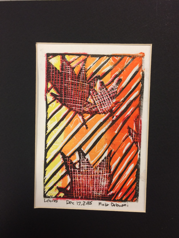
 The Point of this project was to make a realistic picture, using paint and a block print. One thing that I learned was to bend lines to show direction in the leaves. Using different styles of ink drawing play a big part in contrast. If it was all the same there would be no contrast in the drawing. The mood is a gloomy autumn day and it makes me feel relaxed. I found this to be the hardest project overall. But, I finished and I think it looks good.
The Point of this project was to make a realistic landscape, using pen and ink to make contrast and texture within the drawing. One thing that I learned was to bend lines to show direction in the leaves. Using different styles of ink drawing play a big part in contrast. If it was all the same there would be no contrast in the drawing. The mood is a gloomy autumn day and it makes me feel relaxed. I found this to be the hardest project overall. I tried my hardest but it really doesn't look as I imagined it in my head. At least I tried though. 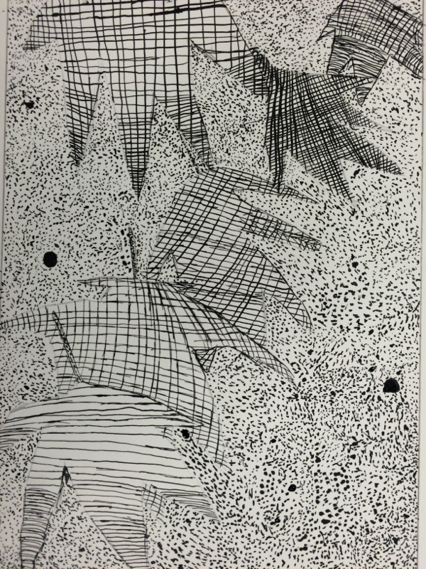 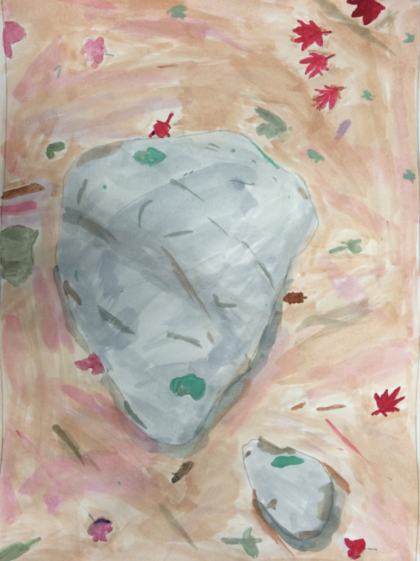 The Point of this project was to make a realistic landscape, using watercolor to blend colors and make it look good. One thing that I learned was to outline colors under the dark colors so hints of the light colors will show up in the end. Blending and contrasting colors play a big part of this when making the background and the leaves themselves. The mood is a gloomy autumn day and it makes me feel relaxed.
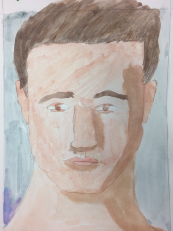 This assignment is a self portrait face painting. We used a program on the iPads to get the general shape of our faces and then we drew them on a piece of paper. Then, we used watercolor to paint them in after the pencil outline. One skill I used to make this was using the light colors first then the dark colors to make the skin looks like it has layers. The main art elements used are line, value, and color. The blue background gives a calming mood to this drawing.
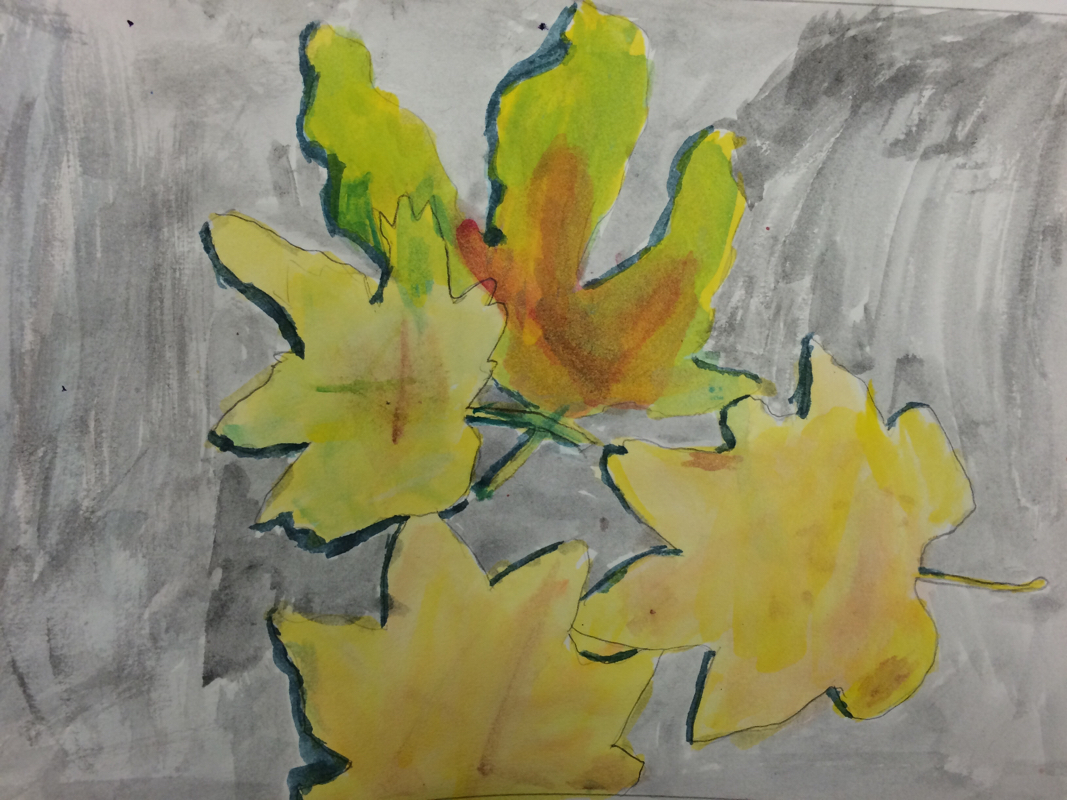 The Point of this project was to make realistic overlapping leaves with shadows, also using watercolor to blend colors and make it look good. One thing that I learned was to out light colors under the dark colors so hints of the light colors will show up in the end. Blending and contrasting colors play a big part of this when making the background and the leaves themselves. The mood is a gloomy autumn day and it makes me fell relaxed and a little bit tired from the gray background. |
Author
Archives
January 2016
Categories |
 RSS Feed
